R/qtlcharts Interactive charts for QTL data
R/qtlcharts is an R package to create interactive charts for QTL data, for use with R/qtl.
A QTL is a quantitative trait locus: a genetic locus that contributes to variation in a quantitative trait. The goal of R/qtlcharts is to provide interactive data visualizations for QTL analyses, and to make these visualizations available from R.
The interactive visualizations are built with the JavaScript library D3 (version 7) and are viewed in a web browser or with RStudio.
A set of reusable graphics panels form the basis for the larger visualizations.
To cite R/qtlcharts in publications, please use Broman KW (2015) R/qtlcharts: interactive graphics for quantitative trait locus mapping. Genetics 199:359-361.
- Installation
- User guide
- Developer guide
- d3panels: reusable graphic panels
- Use with R Markdown [Rmd source]
- List of chart customization options
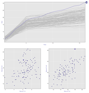
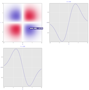
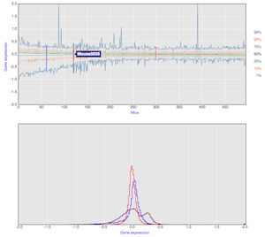
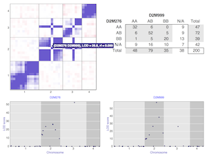
Example charts
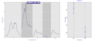
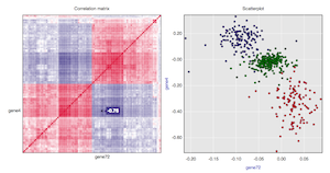
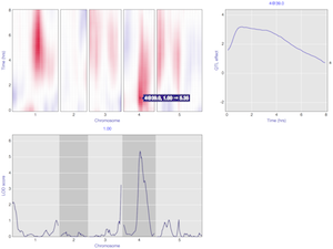
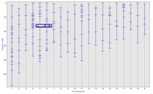
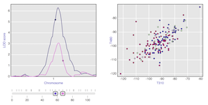
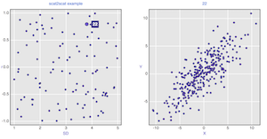
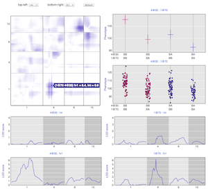
Click on a chart for the corresponding interactive version.
|
|
|
|
|
|
|
|
|
|
|
Sources on github: