I’m making some progress learning D3 (for interactive graphics), by which I mean I’ve gotten a couple of examples to work.
Many box plots
First, an example for displaying many distributions. Here I’m considering a set of nearly 500 gene expression microarrays, each with 40,000 or so measurements. It’s hard to look at 500 box plots side-by-side, and with 40k measurements, traditional box plots don’t give enough information about the tails.
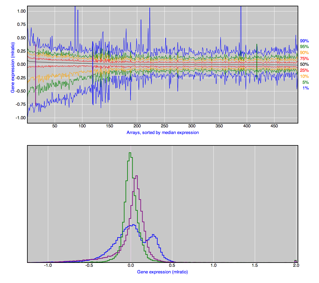
In the top figure, the 500 arrays are aligned next to each other, sorted by their median, and then I show the 1, 5, 10, 25 50, …, 99th percentiles. The advantage of the interactive plot is that you can hover over a given array on the top and see a more detailed histogram below. And if you click on an array, its histogram will be retained below, for easy comparison to other arrays.
LOD curves and QTL effects
As a second example, I plot the LOD curves from QTL analysis across the genome; click on a chromosome above and you get a more detailed view of that chromosome in the bottom-left; click on a marker position in the bottom-left, and you get a view of the QTL effect on the bottom-right.
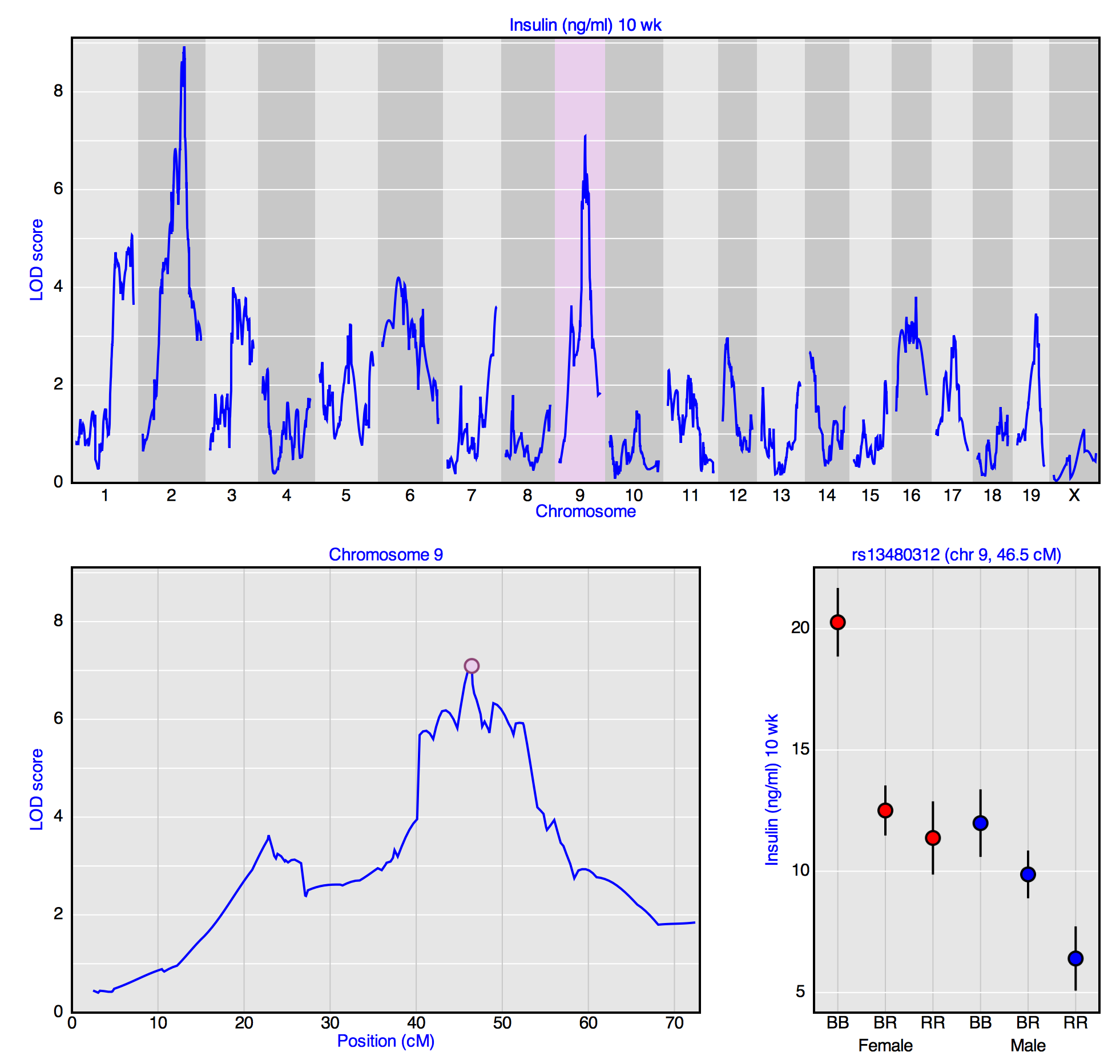
Likely none of that is understandable; let me try to explain. QTL stands for “quantitative trait locus,” a region of the genome (i.e., locus) that influences some quantitative trait (like insulin level in serum). To identify QTL, we look at the association between the quantitative trait and genotype at each of many genetic markers across the genome. We’re basically doing analysis of variance, but we express the results as a log10 likelihood ratio, called the LOD score.
The advantage of this interactive graph is that you have some ability to look at the underlying genotype/phenotype association, rather than just rely on LOD curves. It would be nice to include the option of a dot-plot on the lower right, rather than just the within-group averages.