Last week, I wrote about the Johns Hopkins Bloomberg School of Public Health logo. I now present part 2 of the story.
Hopkins SPH had done some fancy renovations of part of the building, including an important new feature, the “Wall of Wonder": a big display composed of nine LCD screens in the atrium of the building, to display various PR type stuff. (“Wall of Wonder” (WOW) is the official name! Consider the Wall of Wonder policies, inspired by the events I detail below.) Here’s a photo:
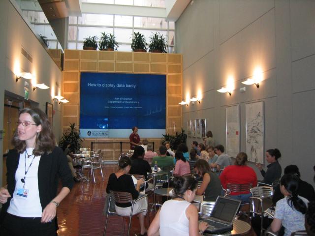
A number of us in Hopkins Biostatistics had the idea to have a short seminar series on Friday afternoon just before Happy Hour, making use of the WOW. (Fridays at 4, biochemistry graduate students sell beer, and lots of SPH faculty, staff, and students gather to drink and chat.) The concept was informal lectures about different statistics topics, suitable for a general audience. Here’s the list of talks from 2005-2006.
I volunteered to do the first one, on “How to display data badly,” a lecture I’d given in my “Statistics for laboratory scientists” course, inspired by Howard Wainer’s 1984 article in The American Statistician. It took a lot of negotiations to get access to the WOW, and even more to get beer served early and at the seminar. But we pulled it off.
The concept of my talk was to take a reasonably good graph, like this:

and then show how to turn it into a terrible graph, like this:

In addition, as an ancillary commentary on the use of gratuitous animation in slides, I animated the School’s logo on each slide, with those animations becoming increasingly intrusive as the talk went on. Then, at the summary slide, it was flying all around. I wasn’t going to refer to the logo in any way, or say anything about slide animations at all. I just thought it would be a funny backdrop.
Well, to get the slides on the computer that drives the big screen, you need to send them to the Office of Communications. So I did that the morning of, and then went off to teach a class. When I got back to my office, I had a voice mail from someone in Communications, saying that they had applied the School’s PowerPoint template to my slides. (This was back in the days when I was using PowerPoint; you can see the slides for all of the talks I’ve given since 1998 here; I stopped using PowerPoint in 2006.) The Communications person said that since she wasn’t as facile with PowerPoint as I was, I might want to take a look at the slides to be sure they were okay.
Of course, the animated logo was gone. But also my slides had a blue background, while the School’s template had a light background, and so all of my “nice” figures looked terrible, being big blue rectangles in the middle of a light background. And this was a talk about good (well, actually bad) graphics!
I could tell it would take all the time I had left before the talk to fix the figures, so I had to choose:
-
Fight, but probably lose, and then be stuck with ugly slides.
-
Cave in, and clean up the slides.
I wish I could say I chose the former option, but I’m weak, and I chose the latter.
After, there was considerable discussion in the Dean’s office about my “abuse” of the School’s logo. And they created a formal policy on the use of the Wall of Wonder, which includes:
When there are School events that involve external audiences the Office of External Affairs will manage the content of the Wall so that it is appropriate for the event.
You can see the slides as presented, as well as the “Director’s Cut”, at my web page
Here’s a slide from the Director’s Cut (the colors matched better originally; that they don’t now is one of the many reasons I hate PowerPoint):

And here’s how it was presented:
