I was thinking about department websites, partly because my own department’s website is terrible, and recently a colleague asked me whether I could suggest some good department sites.
I’ll describe the basic principles for a good department website, and then I’ll comment on a number of examples.
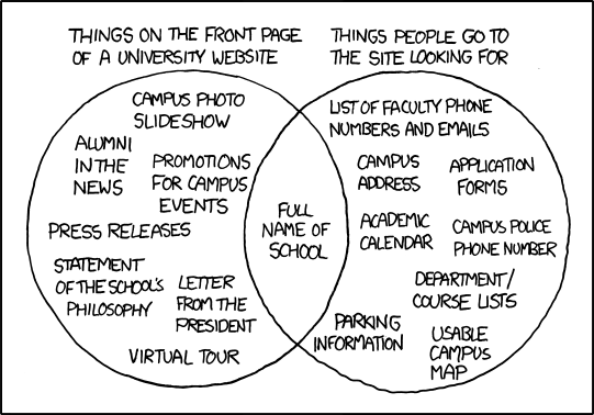
But first: No discussion of academic web pages is complete without referring to the xkcd comic on University websites, so let’s start with that:
Basic principles
Here are what I see to be the basic principles for constructing a department website:
-
Think of the audiences and what they’d be looking for
-
Prospective students
-
Prospective/visiting faculty
-
Current students
-
Collaborators
-
Administrators
-
Current faculty
-
Department staff
-
-
Keep the important stuff near the top; minimize bloat
-
Here’s the key stuff that should be prominent:
-
Degree programs; courses; how to apply
-
Faculty and student pages
-
Staff contact information
-
Seminars
-
Job opportunities
-
-
Don’t use stock photos or (even worse!) clip art
-
Avoid deep nesting of information
-
Have meaningful URLs (in particular, don’t let drupal use
node/134) -
Have a consistent style across the official pages – particularly in the location and layout of menus of hyperlinks
-
I prefer minimalism. Think google or apple rather than Microsoft.
Some examples
I briefly perused a number of statistics and biostatistics department websites. Here are my first impressions. The sites for Berkeley, Stanford, and Minnesota Statistics were my favorites.
The key bits are half-way down the page, due to unnecessary (in my mind) school-related crap along the top, plus the news items. The “Quick find” looks-like-a-drop-down-menu at the top right seems to just link to a different department’s web page. The news items at the top result in the menu moving upward when you click on a link (as those news items don’t appear in the subsequent pages).
There’s too much school-related crap at the top, but it’s not as bad as the Hopkins site. I like having pages “For Prospective Students,” “For Current Students,” etc., but they pop to pages that look totally different and lose that menu, so you have to go back and then forward again. “Student Profiles” maybe should just be called “Student Profile” as there doesn’t seem to be more than one. The “BIO” in “BIO Faculty” and “BIO Researchers” was a little confusing: Is it obvious what “BIO” means, and is it really necessary? I’d put the Faculty and Researchers links closer to the top and may try to distinguish the different classes of links: the ones that people are really there for, and then all of the “For Such-and-Such” somewhat separately.
Reasonably clean, but a bit of the node/134 problem. And there are two kinds of menus: tabs at the top, and a menu at the right side. I think it’s okay, but it was a bit confusing initially: It wasn’t immediately obvious that I click a different tab to get a different set of menu choices.
The main page looks nice, but the sub-pages have a different format.
I generally like it, but why split the faculty list across multiple pages? I see no reason to limit the length of a web page; scrolling is our friend.
Way too much bloat at the top; links all over the place at the bottom
I like this one. I’m not sure about the color choices, but the site is clean, and it’s easy to navigate. And I like the choice and order of topics in the menu at the left.
I really like this one: Just the facts, plus a picture of Sequoia Hall. There’s a little menu bar at the top that has the key stuff. You want to know about courses or degree programs? Click “Academics.” You want to know about People or Seminars? They’re right there at the top. How do you apply? Click “Admissions.” They could maybe trim the news on the left of the front page; some of it is getting old and at least one of the links doesn’t work anymore.
Berkeley is slightly better than Stanford. The websites, I mean. It’s simple, there’s a clean little menu at the top, and the menus at the top have clear little drop-down menus when you hover over things. I like that they use more horizontal space. I guess I wouldn’t put “Seminars” under “Research” Nor would I put “Alumni Connections” under “Industry.” So there are ways in which Stanford is better than Berkeley.
The front page looks a bit cluttered. And they list University rankings front and center, which is a bit of an embarrassment. There’s a bit of school-related stuff at the top, but it’s not as bothersome as some others. There may be too many choices on the left. It’s hard to pick out the ones you want, even if they’re there. And “Students” should really be “For Students,” while “Careers” should really be “Alumni Profiles.”
Of course, I could look at a ton more, but I’m sort of sick of this. Go have a look yourself, and let me know if you find good ones.