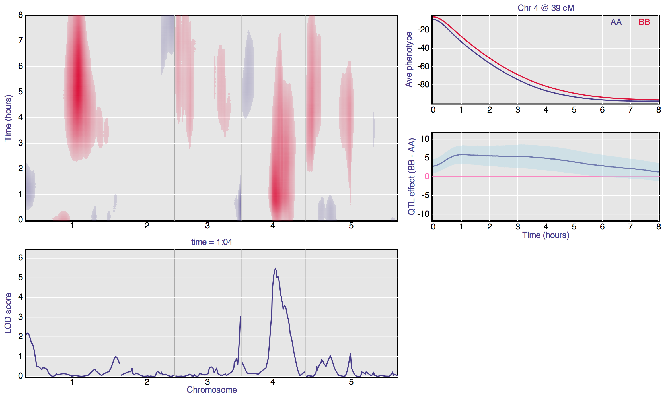
I’ve created another D3 example, of QTL analysis for a phenotype measured over time. (Click on the image for the interactive version.)
The code is on github. It took me about a day.
The hardest part was figuring out the right data structures. A pixel here is linked to curves over there and over there and over there. You need to set things up so it’s easy to traverse such linkages.
If you hover over a point in the top-left image, you get views of the vertical and horizontal cross-sections. If you click on a point, pointwise confidence bands are added to the “QTL effect” plot. (You have to click, because if I included those confidence bands automatically, the graph became painfully slow to refresh.)
I’m not completely happy with the layout of the graph; it’s not particularly intuitive.